Colour Contrast
Colour Contrast - The Clash
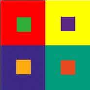
Colour contrast describes colours that are opposite each other on the colour wheel (Complimentary colours);
- Red and green
- Blue and Orange
- Yellow and Violet
they ‘Clash’, they ‘vibrate’ next to each other and therefore they give the maximum contrast against each other.
As always this can further be defined (complicated) and broken down into:
- Hue Contrast ,
- Value Contrast
- and Saturation Contrast
(for more informtion click here)
This can be vital in giving your painting impact.
For example setting a house with a terracotta tiled roof against a background of green trees will make your painting ‘pop’ as some people like to say.
In the painting to the right you will see the warm reddish orange of the trees set against the cool grey background giving colour and temperature contrast, there is also tonal contrast between the very dark beneath the trees and the rest of the painting.


Yellow and Violet
The cool violet dress and center of interest here contrast well against the warm foreground.
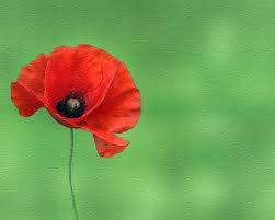
Red & Green
This is why the classic red poppy against a green background works so well.


Blue and Orange
As in this beautiful painting by Vincent Van Gogh.