Wheels Of Colour
"The value of the color wheel is its ability to help designers create appealing palettes"
(So Many!) Colour Wheels
I had known what a colour wheel was since infant school,
red and yellow make orange etc.
but i became aware that it was more useful for something else, but what? it seemed quite difficult to find an answer.
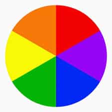
The Primary Colours
Are obviously:
- Red,
- Yellow
- and Blue.
The Secondary Colours
Blue + Yellow = Green,
Red + Blue = Violet/Purple,
Yellow + Red = Orange.
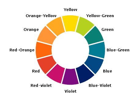
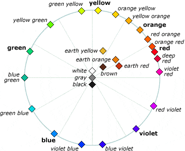
The Tertiary Colours
(Also known as intermediate colours)
Mix a primary and a secondary colour.
There are six tertiary colors;
- red-orange,
- yellow-orange,
- yellow-green,
- blue-green,
- blue-violet,
- and red-violet.
So what do we do with the colour wheel?
1. We can find a colour's complimentary colour,
It’s ‘opposite’ on the colour wheel, for example red’s complimentary colour is green.
By placing green next to red in a painting the colours will ‘clash’ giving you maximum contrast. Therefore if you wanted a red house as your focal point in the painting you could surround it by green trees to give your focal point impact.

2. We can Neutralise a Colour,
If you want to neutralise a colour (grey it / tone it down) you simply add it’s complimentary colour.
So for example in landscape painting you might want to make a hill or a tree recede a little into the distance, you could simply add its complimentary colour.
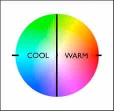
3. Find Colour Temperature
The colour wheel can show which colours are warm and which are cool.
Generally
Blue, Green and Purple = Cool Colours
Red , Orange and Yellow = Warm Colours
In a painting warm colours advance and cool colours recede giving the illusion of distance.
4. Mix Beautiful Greys
And of course you can just make beautiful greys, fabulous for colour contrast. By mixing 3 primaries or a primary and it’s complimentary colour.


Colour Schemes
Colour schemes are talked about quite often in painting and are a choice of colours,
In order to produce a harmonic painting it is a good idea not to use too many different colours from around the colour wheel ,
Try using a colour scheme.
Below is an awesome video with John Pototschnik going into detail about colour schemes. He is an oil painter but the concept is the same for watercolour.
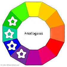
Analogous Color Scheme
This is producing a painting using mainly three or four colours that are adjacent on the colour wheel. This gives the painting harmony avoiding colours that clash and avoids making muddy colours.
Triadic Colour Scheme
Three colours having a triangular relationship on the colour wheel.
Create a painting using three colours that are evenly spaced on the colour wheel.
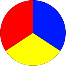
It could be three primaries – red, yellow and blue
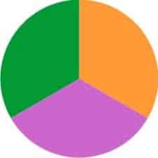
three secondaries – green, orange and violet,
or three tertiaries evenly spaced


Complimentary Triad Colour Scheme
This is using a pair of complimentary colours and the colour that is halfway between them
The Split Complimentary Triad
This is one colour and the two colours that are adjacent to it’s complimentary colour.


The Rectangular Colour Scheme
Choosing four colours around the wheel.
Monochromatic Colour Scheme
Using just one colour

For more information on colour schemes see here https://drawpaintacademy.com/color-schemes/
There's more..
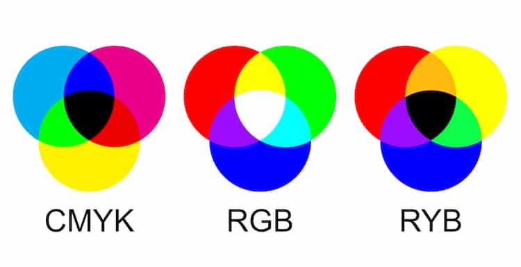
Sets of Primaries
Primaries are hues that can produce a large range of colours.
There are different sets of primaries.
RYB on the right is the most familiar model called subtractive colour mixing as the colours absorb the light until becoming black.
CMYK (K=Black) are also subtractive primaries, used in printing, red is swapped for magenta and blue for cyan to produce a wider range of colours.
RGB primaries are ‘additive primaries’ coloured lights shone on black until all are mixed to produce white, used for televisons and computer screens.
A Short History of Colour Wheels


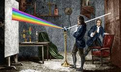
Sir Isaac Newton and the Visible Light Spectrum.
Before Newton’s discoveries it was commonly known that a prism would produce all the colours of the rainbow, the common theory was that the prism added impurities to the ‘perfect’ white light.
Around 1665 Isaac he produced an experiment with two prisms that proved it was not the prism that was colouring the light: but that the colour was already there in the light.
Here’s BBC’s Earth Lab and Brian Cox with a brilliant explanation.
By shining the first prism’s rainbow through a vertical gap he selected an individual colour from the first prism, say green for example.
He then directed this light into a second prism which went on to shine on a wall and the light was still green, this proved that nothing was added by the prism.
Therefore proving that white light was made up of all the rainbows individual colours and that surfaces/ objects refract light into colours.
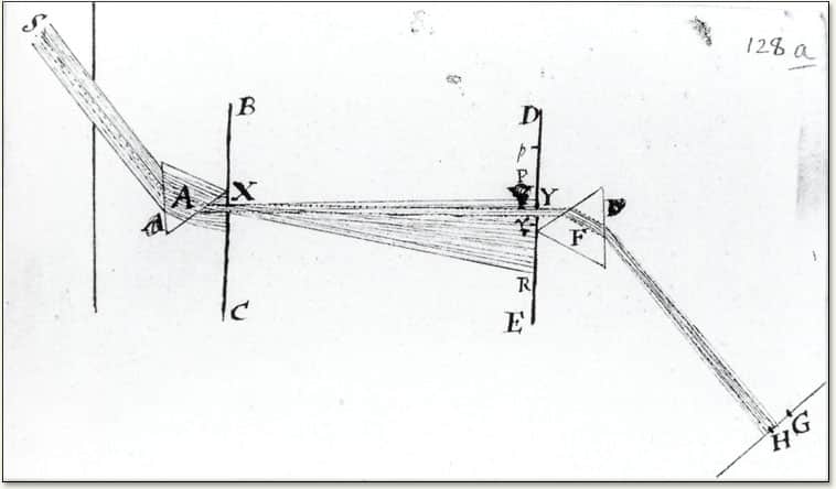
He created the first colour wheel in 1704
He also divided the wheel by the musical scale for some reason? click here for a better explanation
His experiments showed that red, blue and yellow were the primary colours and with these all other colours could be mixed. (not quite true apparently)
He arranged the colours into a circle which was useful to artists to show the complimentary colours, that would enhance the other colour’s effect through optical contrast.


Boutet Colour Circle
1708
A colour wheel with 12 hues.
Probably the first based on Newtons Colour Circle showed the complementary Colours

Goethe
1749
Johann Wolfgang von Goethe
Also working with prisms he produced the ‘inverted spectrum’ of yellow, purple and turquoise.
He realised Newton must have missed something. saying that darkness also has an effect on colour, colour is also based on contrast, that it was not fair to say that colours are only produced by white light, colour is created between light and darkness.
Goethe realizes that the sensations of color reaching our brain are also shaped by our perception.
He arranged the colours in what he called their ‘Natural Order’ in a symmetrical colour wheel.

Moses Harris
1769
RED light looks RED because it emits RED light.
You perceive something RED to be RED because it reflects RED light and absorbs all other colours except the RED light falling on it.
Moses showed the ‘subtractive mixing of colours’.

Albert H Munsell
1858 – 1918
Established a system that accurately identified every color that exists.
He invented the photometer a device that measured the luminance of an object
Handprint
The mixture of blue and yellow light makes white, but the same mixture in paints makes green.
If you have a few hours to spare you could read this:
The Pocket Wheel
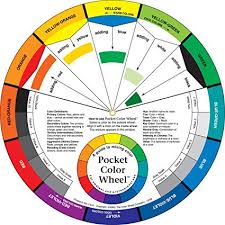
A simple widely available aid to show colour mixing results.

My Colour Wheel
Rightly and probably Wrongly this is my colour wheel.
Colour can be an extremely confusing and complicated subject. Having read quite a lot and watched quite a lot of videos on the subject, I conclude that it is very useful to put your colours from your chosen palette on a homemade colour wheel, thus learning the relationships between colours and how to mix bright or neutral colours, and committing it to memory as much as possible.

Although the top diagram below is back to front compared with mine ,I found it useful for finding where the diferent pigments lie when creating my own colourwheel.
It shows for example that Hansa Yellow Light Y3 (HYL) is closer to Cobalt Blue than Hansa Yellow Medium Y97 (HYM).
Therefore if mixed together HYL + CB will give a brighter green than HYM + CB.
It also shows for example that Quinachradone gold is between my Pyrrole Red and my Hansa Yellow Medium.
It shows that Raw Sienna is nearer the centre and therefore has low chroma or is nearer to grey.
.
It shows that raw sienna is the complementary of cerulean blue and therefore if mixed will produce a grey.
I chose Antwerp Blue for my dark blue for it's non-staining qualities, however as it doesn't show below, therefore I simply 'google' 'Antwerp blue handprint' to see a list of blues https://www.handprint.com/HP/WCL/waterb.html and scroll down till i find antwerp blue in the list of pigments PB27 with prussian blue which i can then locate on the diagram below.

